This module is basically about my personal career, branding, and interest. I really like working on this module because this is a really great platform to develop ourselves rather than just working on uni's works. Therefore, this module is really useful to build up our career in the future and after graduation. It allows us to make a good plan of what we need to do afterward, otherwise, I am sure most of us don't really sure what to do in the future.
During the module, I am really happy to develop my own branding, as a professional designer, we should have our own branding to promote our works and show to different clients. Usually, I just design brands for the clients, while, this time was about myself. Therefore, everything that I made represents to me. I really like everything that I made for my personal branding, especially the illustration in the anime style of myself.
I made a clean plan that I really want to do after graduation, I will keep practicing my illustration skill if I want to work on this industry. Studying the Japanese language is the compulsory thing if I want to study aboard in Japan. In this year, I joined the Japanese society at "University of Leeds" and I met a lot of Japanese friends which is one of the best things I have done over this year.
Overall, I think I become more independent and professional in this year, we have more independent study day in this year, usually, we just need to go back to university on Monday and Friday, the rest is just working independently. I remember during the first year, we need to go back to university from Monday to Friday and most of the days were from 9:30am to 3:30pm. However, this year, we just need to stay around one day from 10:00am to 3:30pm. I spent most of my time working in studio and accommodation rather than having a lecture so I think it is the main difference compared with the previous two years as we are more "professional".
No matter the time-planning and quality of the briefs that I did this year, I think is better than before and that is what we want to achieve as a student. What I feel quite sad is when I sent the emails to some studios, I couldn't get a reply or they don't allow me to visit their studios. However, when I go back to Hong Kong, I will definitely visit some studios, workshops, and galleries extend my knowledge and skills.
Thursday, 25 April 2019
Studio brief2 evaluation
I would describe this year as “Semi-professional year”. As we worked on individual briefs based on our specific interest, it was different to last two years. This year is more like working as a “professional graphic designer”. After graduation, we need to start working as a full-time designer, so I will definitely miss everything at the university. Over the year, I appreciated everything I have done because it showed my effort and improvement. I really happy that I developed a lot of skills this year which I didn’t usually do it in the past and all of them are really useful to my design career. What I can do better is be more confident in everything that I have designed, I should be proud of my designs.
Wednesday, 24 April 2019
Character with Japanese anime style
Recently, I looked at a website about western movie characters transforming to Japanese anime style. I found it is really interesting.
The movie is "Harry Potter", it is one of my favourite movie for sure but I couldn't imagine what it will look like in the Japanese anime style until I looked at this website.


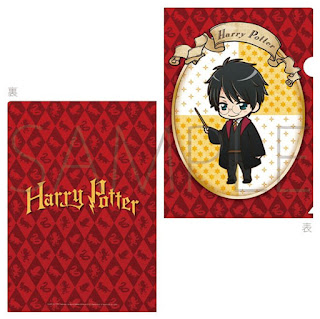 The iconic Hogwarts alumni have been reimagined as manga characters, doe-eyes, button noses and all. I like how the way they make a realistic face into manga style and produce different graphics works which are really inspiring to me. Therefore, I can try to design something like this for my personal branding.
(6A2),(6B2)
The movie is "Harry Potter", it is one of my favourite movie for sure but I couldn't imagine what it will look like in the Japanese anime style until I looked at this website.


(6A2),(6B2)
Digital portfolio
It is a different purpose compared to the booklet, the booklet is mainly for giving people and pocketable. However, the digital version is in A3 landscape so that the size is a larger and wider than the booklet which allows viewers can look clearly to the images. It will be uploaded online through "Issuu" which is accessible
Depending on the event such as exhibition, this A3 portfolio will be printed and shown on the table so it is more comfortable to visitors, working with my other personal branding materials such as business card or the booklet, everything linked to each other.
https://issuu.com/yc265365.1619/docs/digital_portfolio._compressedpdf
I will upload this link through my social media account so that people can have a look of it.
(6C2),(6D2)


Tuesday, 23 April 2019
Promotion for my personal branding


Rather than my business card, I also designed a publication to show most of my best designs from my design journey, basically, it is connected to my business and my personal website so I used the same colour and typeface. This publication allows people to know more what I produced if they are interested, they can contact me.
(6C2)
Printed business card

I printed my business cards using Matt Laminated Card (350g Double-Sided Coated Art Paper) so that the quality is a lot better than 250g Double-Sided Coated Art Paper, the card won't easy to be folded.
(6C2)
Monday, 22 April 2019
Rebrand/redesign for a "Bad design logo"
In this lecture, I think it is really funny and enjoyable which I can learn different from it, basically, in this lecture, we were asked to choose a "Shit design" and how we can promote it based on the bad design, afterwards, we need to rebrand or redesign to make it better and promote it but need to keep most of the original design. I think the lecture is really funny because it is really difficult to promote the company if the logo looks really bad, however, as a designer, we should be creative and love to face challenges.
I choose a Japanese medical brand because the logo looks really bad and misunderstanding. Hence, I want to redesign it.

The brand is "Kudawara", no matter the colour or design, I totally disagree that it is a medical company, furthermore, the main problem is the upper case "K", it seems a couple having sex. Due to this reason, I rebranded for them by taking the letter "K"' idea and the medical company idea. I choose to make it especially selling sex medicine so that it makes everything more sense.


Simply, this lecture allows us to makes everything become possible even it is a bad design, I really like what we produced.
(6A2),(6B2)
Subscribe to:
Comments (Atom)